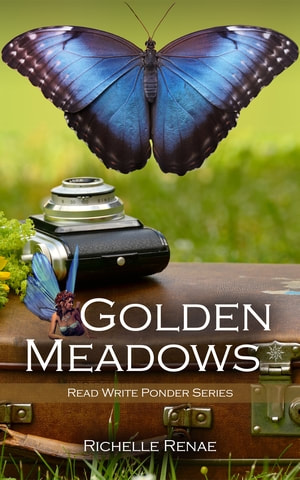
 My key take-away from today's presentation is "Less is more." In fact, Ms. Alcaino said that several times as she discussed the dozen or so covers she selected to talk about from over one hundred submissions that Reedsy received when they announced the Facebook event. The event was a great opportunity for independent authors who do their own cover design (like me) or who commission covers to learn a small fraction of what the designer should think about for a design strategy. These were the highlights that I noted while watching. I should also note that "for your genre" could be appended to nearly all of these comments because the genre of a book should have a great deal to do with the concept and design of the cover. Don't make the image on the cover a literal of the story. The cover should be a hint of the story that draws the reader in to find out more. Trying to capture a whole story in one image will very likely make the cover too busy. Be conscious of how fonts/typefaces can effect the mood or feel of the cover. Titles are often well served up with a sanserif font (no little feet on the letters) regardless of genre, though no Romance covers were discussed. A quick perusal of Romance covers (not in the teen range) have a bit more "scripty" fonts (with curls and swirls), but they are generally very "readable" even with their curls. Titles should be large in size, especially in eBooks where the book is a small thumbnail. In order for those small thumbnails to have readable fonts, they have to be relatively large. In that same vein, author names, especially for debut authors should be smaller than the title. Authors who have become brands (like Lee Child or J.K. Rowling) can sell their books with the power of their names. New authors should be trying to sell their books with the power of their title. Let your title win people over. Shout lines should be short and snappy. When they are too long, the font is too small and they get lost on the cover. Popular colors really depend on genre, but blues and solid whites are broadly popular right now. For non-fiction books, less really is more. Type dominates over image. Many of the popular non-fiction titles out there right now have no images at all. That use their title as the primary hook, and then let their subtitle draw the readers in the rest of the way. Ms. Alcaino recommends no more than four colors on the cover and to try to use bright, zingy colors. If you are publishing the first book in a series, there is no need to put "Book One" on the cover. Instead, consider using it in the blurb on the back cover or just advertise it that way in Amazon in the book details. Finally, know what your book's genre is looking like up to the minute. In other words, go explore Amazon or a book store and look at the books on the shelf. What fonts are being used? What colors? What images? Are the covers matte or shiny? Which ones draw your eye first? A real quick tip at the end of the presentation was for Photoshop users. Cmd + Shift + Y will gray out all the colors that do not print CMYK. I submitted my Golden Meadows cover but was not selected as one of the covers discussed, but I still found the presentation very helpful. I can see where I could improve my covers. (Mine tend on the busy side, if I'm being honest with you.) You can watch the presentation at https://www.facebook.com/pg/wearereedsy/videos/ You can learn more about the cover designer who reviewed the covers at https://reedsy.com/micaela-alcaino
0 Comments
|
 RSS Feed
